CSS Termininology
Introduction
CSS has some specific terminology, like "absolute" and "relative" positioning, floating elements and box models. This article explains what those different terms mean.
Absolute vs relative
The position of an HTML tag (element) can be controlled by with it's left and top, or right and bottom properties. The effect of those properties depend on the type of positioning used.
Relative positioning changes the position of the HTML element relative to where it normally appears. The left and top properties give the element an offset.
Using position: relative; top: 5px;, the element moves from it's original position.
With absolute positioning you define the exact pixel value where the specified HTML element will appear. The point of origin is the top-left of the browser's viewable area, or the top-left position of an positioned container (e.g. an element with a relative position).
Using position: absolute; left: 40px; top: 5px;, the position element is displayed using the position of the container as origin.
Block vs inline
When a browser displays a page, it distinguishes between block elements and inline elements. Not every CSS attribute works the same for the different kind of elements.
The difference between block and inline elements is shown in the following example. Inline elements have a bold font, the paragraphs are block elements.
This is a <p> tag, this forms a block.
Another block with inline elements, these fold within the text, even wrapping to the next line.
Block elements usually occupy all available width, and act as containers for other elements. Inline elements on the other hand, can only be used inside block elements. These elements can't have any margin, width or height, and wrap within the text.
Typical block elements include: <h1> .. <h6>, <p>, <ul>, <li>, <pre>, <form> and <div>.
Typical inline elements include: <b>, <i>, <a>, <strong>, <em>. <cite>, <code> and <span>.
Floating elements
 Ever seen an image with text wrapping nicely arround it?
It's likely the image was an floating element.
Just like the image in the first paragraph.
The floating image doesn't break the normal flow of the text.
Ever seen an image with text wrapping nicely arround it?
It's likely the image was an floating element.
Just like the image in the first paragraph.
The floating image doesn't break the normal flow of the text.
Effect of floating elements
A floating element can be created with a float: left;
or float: right; attribute.
This removes the HTML tag from the normal flow.
This example reveals what actually happens:
This is a paragraph with an floating image.
This is another paragraph. When more text is included, it wraps arround the floating image. The <img> tag from the first paragraph has a
float:left;attribute.
The paragraph borders show that the paragraphs ignore the image element entirely, as if it doesn't exist in the HTML code. The floating image however, does affect the text in both paragraphs. The text curls nicely arround the image.
The floating element also "escapes" from it's container. When the floating effect is disabled, the container expands to fit all contents.
Adding a clear element
Sometimes the float effect is desired, but the escaping is not. This can be fixed with a clear element. A clear element can be created with a clear: left;, clear: right; or clear: both; attribute.
This element has a clear attribute.
The element appears below the floaing one due to it's clear attribute. It's top-margin is in fact expanded until the float is cleared. This effect can also be used to expand a container:
The W3C float specification requires that a cleared element shall stay below all previous floats. Previous in this case means any float that comes earlier in the source document. If the clear element is within a floated container however, it will clear only the floats that preceed it within that floated container.
Multiple floating elements
Multiple floating elements have the properly to float next to each other. This creates some interesting column-style effects:
The first floating element. The second floating element. A clear element
When the container becomes too small, both the second float will automatically drop to the next line:
The first floating element. The second floating element. A clear element
Quirks and strict mode
In the past, web browsers had all kinds of quirks. Netscape also had it's rendering bugs. When the market share of Internet Explorer was still small, it emulated the bugs and quirks Netscape had.
With the introduction of newer layout techniques, it became important to support one standard. Browsers still need to be compatible with older pages, which is why the developers of these browsers implemented two rendering modes: Quirks mode and Strict mode.
In Quirks mode, the browser emulates the bugs like it used to have in the past. In Strict mode, the browser follows the web standards defined by the W3C. Some CSS features are only available in Strict mode!
Doctype switching
Browsers implement a simple trick to switch between these rendering modes: the <!DOCTYPE> tag is used to enable the correct rendering mode. Since older web pages don't have a DOCTYPE, these pages are rendered in quirks mode automatically.
These DOCTYPEs are known to activate strict mode:
- Valid DOCTYPEs to activate strict mode:
<!DOCTYPE HTML PUBLIC "-//W3C//DTD HTML 4.01 Transitional//EN"
                   "http://www.w3.org/TR/html4/loose.dtd">

<!DOCTYPE HTML PUBLIC "-//W3C//DTD HTML 4.01//EN"
          "http://www.w3.org/TR/html4/strict.dtd">

<!DOCTYPE html PUBLIC "-//W3C//DTD XHTML 1.0 Transitional//EN"
          "http://www.w3.org/TR/xhtml1/DTD/xhtml1-transitional.dtd">

<!DOCTYPE html PUBLIC "-//W3C//DTD XHTML 1.0 Strict//EN"
          "http://www.w3.org/TR/xhtml1/DTD/xhtml1-strict.dtd">
The <!DOCTYPE> tag should be placed above the <html> tag. By adding the doctype, you promise a browser your web page uses valid HTML. This can be verified with the W3 Validator.
Lookup which mode is used
In Mozilla (Firefox), you can find the rendering mode in the "Page information" dialog.
For Internet Explorer, run the following code in the address bar:
javascript:alert(document.compatMode);.
More information about this subject can be found at:
Box model
Each element or tag of a page is represented by a visual box. It can be positioned with a left and top, or right and bottom coordinate.
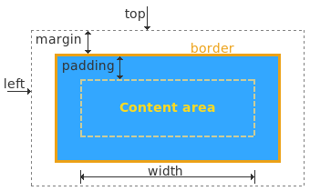 The Box model, as defined by the W3C.
Elements may define a margin and padding space. The difference is subtile, the margin lies outside the border. This defines where and how an element is displayed at a web page.
Internet Explorer issues
Unfortunately, there is one other difference. In the past, Internet Explorer used it's own version of the box model:
 The Box model, as interpreted by MSIE 5.x.
As you can see, the width differs in this picture. The element height is also affected. The padding and border size is included in the total width and height!
Internet Explorer 6 uses the W3C Box model, but in strict mode only. Older versions of Internet Explorer render all pages in quirks mode. The Internet Explorer Issues article describes a solution in depth. As of CSS3 it will be possible to specify which box-model should be used, because each model has it's advantages.
Collapsing margins
If you see jumping boxes - depending on setting a border or padding - your margins are likely collapsing or put apart. Normally, margins are merged together. The bottom and top margin of a paragraph are layed on top of each other. This is reasonable behavior for inline text. At other moments, it's undesirable.
Some properties undo this effect. For example:
- border
- float
- overflow: hidden or auto
- clear
- display: inline-block
- position: absolute
This saved me a lot of time - know where your margins come from!
blog comments powered by Disqus